Our brand, in your hands.
Sharing Our Life with your family, your followers, or your favorite blog? Grab the logos, colors, and a few quick tips below. Free to use — just keep the heart and the gradient intact. Our tagline is "Less mental load. Every day." — please lead with the outcome, not the feature.
The mark & the wordmark.
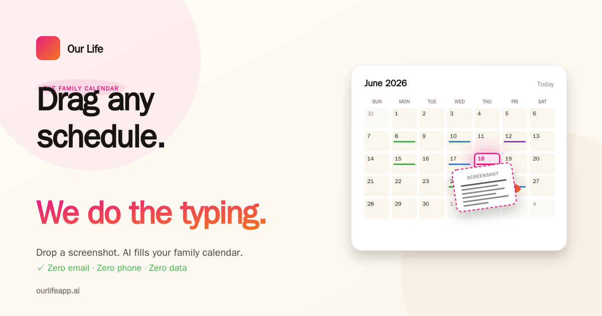
Click any tile to download. Use the full lockup whenever there's room. Use the mark on its own only when space is tight (app icons, avatars, favicons).
The palette.
Click any swatch to copy the hex code. Default to pink + orange + cream + ink — the other colors are reserved for the in-app calendar member pills.
One typeface, three weights.
Our Life uses Plus Jakarta Sans across the app, marketing, and brand assets. It's free on Google Fonts.
A few quick rules.
Our brand is warm, human, and a little quiet. Please keep it that way.
Keep the gradient direction.
Pink → coral → orange, top-left to bottom-right. It mirrors the warmth of a Sunday morning.
Recolor the mark.
The heart in the brand gradient is the mark. Solid black or single-color versions look off-brand.
Use cream, not pure white.
Default page background is cream (#FAF6EE). White is reserved for cards and surfaces sitting on cream.
Stretch or skew the logo.
Scale uniformly. Keep at least its own height of clear space around it.
Call it "Our Life," not "Ourlife."
Two words, both capitalized. The app's full name is "Our Life · The Family Calendar."
Swap our tagline.
Our tagline is "Less mental load. Every day." (or, in long form, "You don't need another calendar. You need your time back."). "The Family Calendar" is the category descriptor — fine in a brand mark, not a substitute for the tagline.
Grab the full kit.
Logos in every size, social banners for every platform, app icons, and a social-launch pack (6 post concepts × 2 ratios) with captions.
ourlife-public-kit.zip
Logos · icons · banners · social content · color & type reference.
© Our Life LLC · ourlifeapp.ai Journalist or reviewer? Request the press kit →